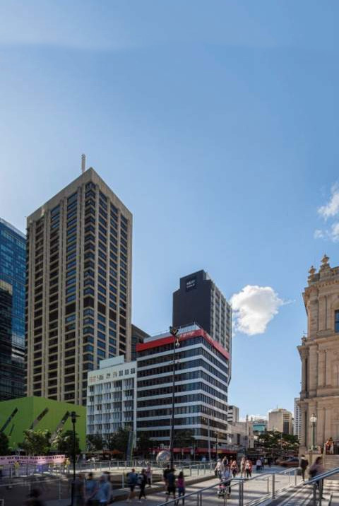
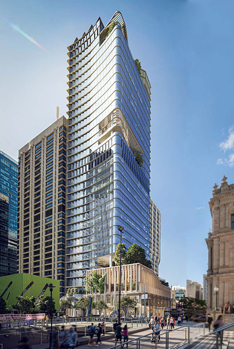
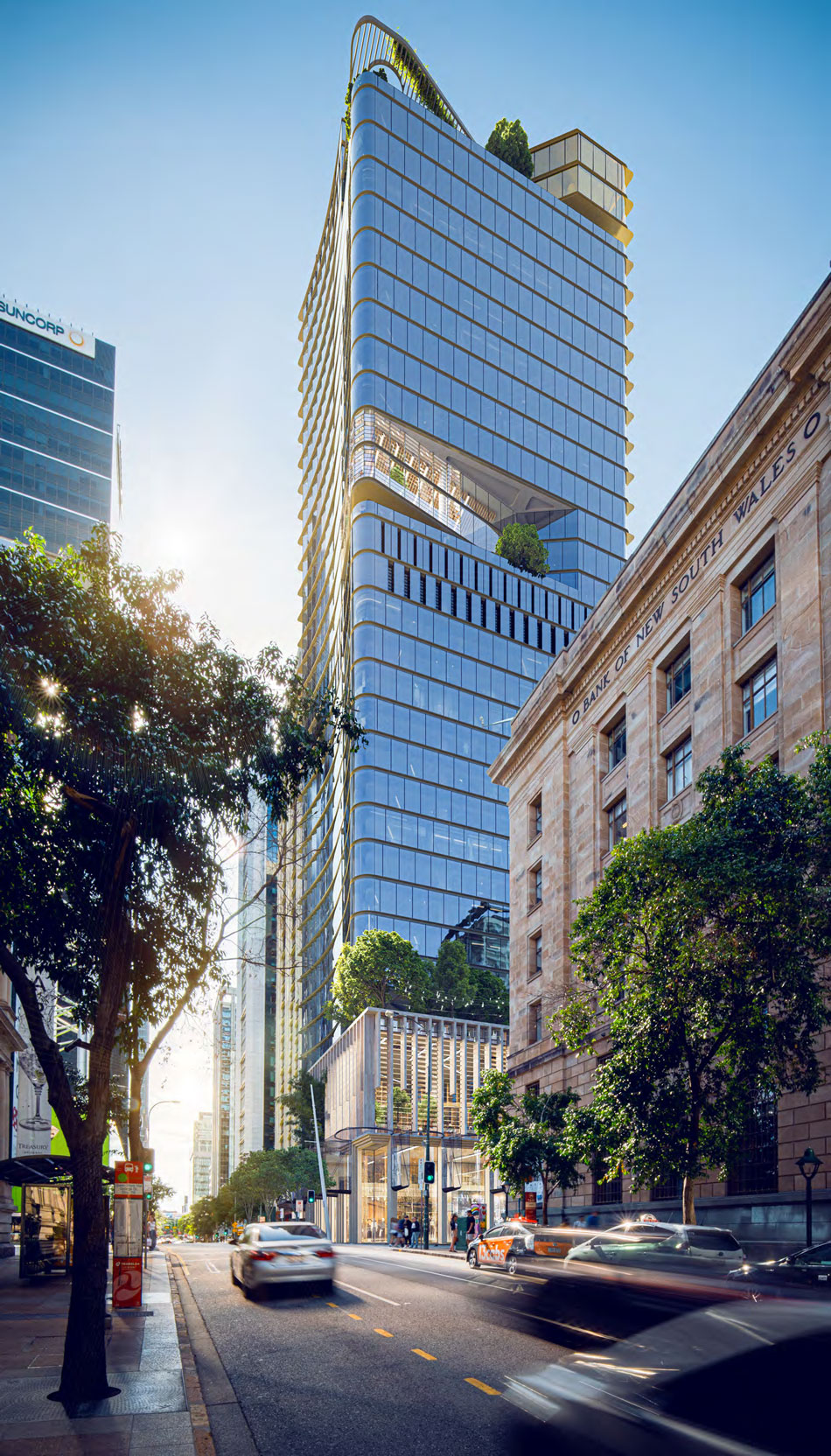
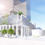
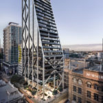
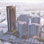
A development application for a has been proposed by Charter Hall for a new 34 storey commercial office tower located at 60 Queen Street, Brisbane City.
The application replaces a previous 81-storey residential tower scheme that was proposed back in 2017.
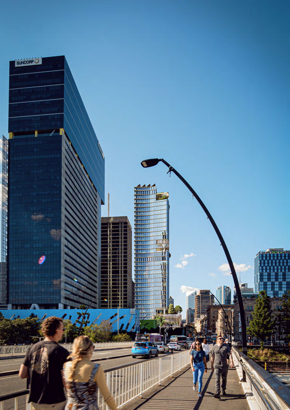
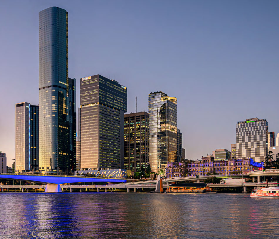
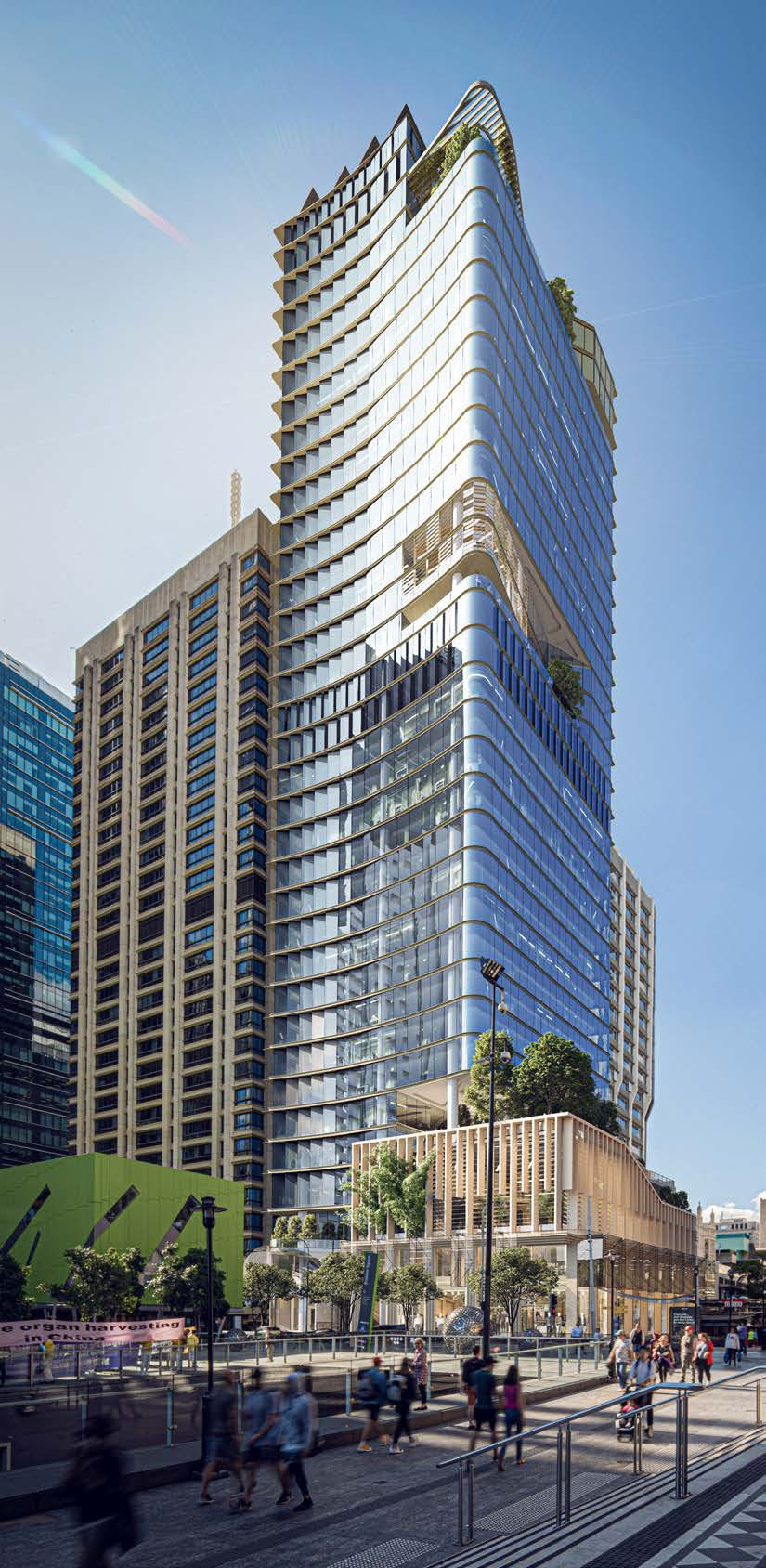
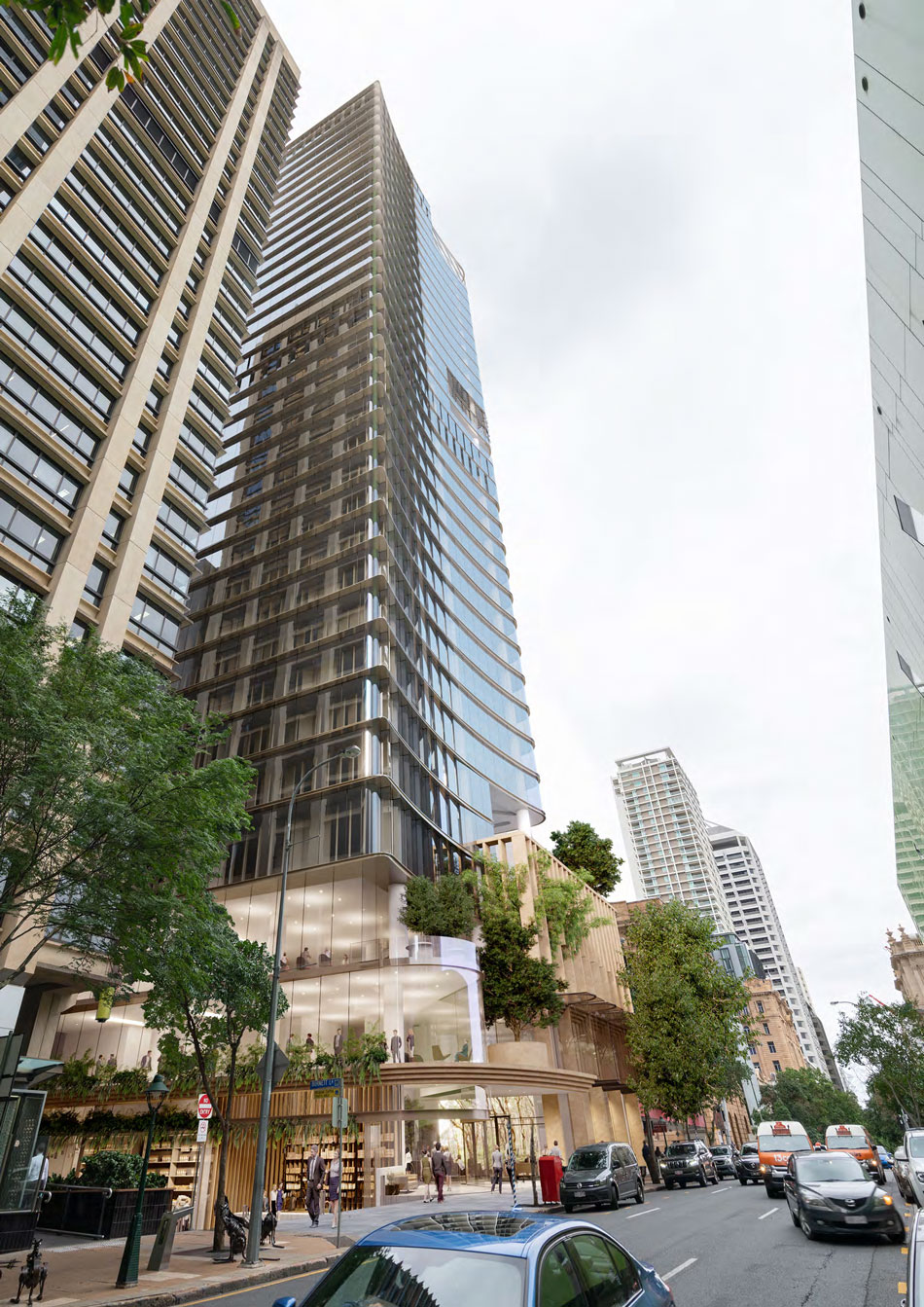
This new application, which has also been designed by Brisbane-based Blight Rayner, features a tapered tower design and aims to achieve all 31 criteria of Brisbane City Council’s ‘Building’s that Breathe’ guidelines.
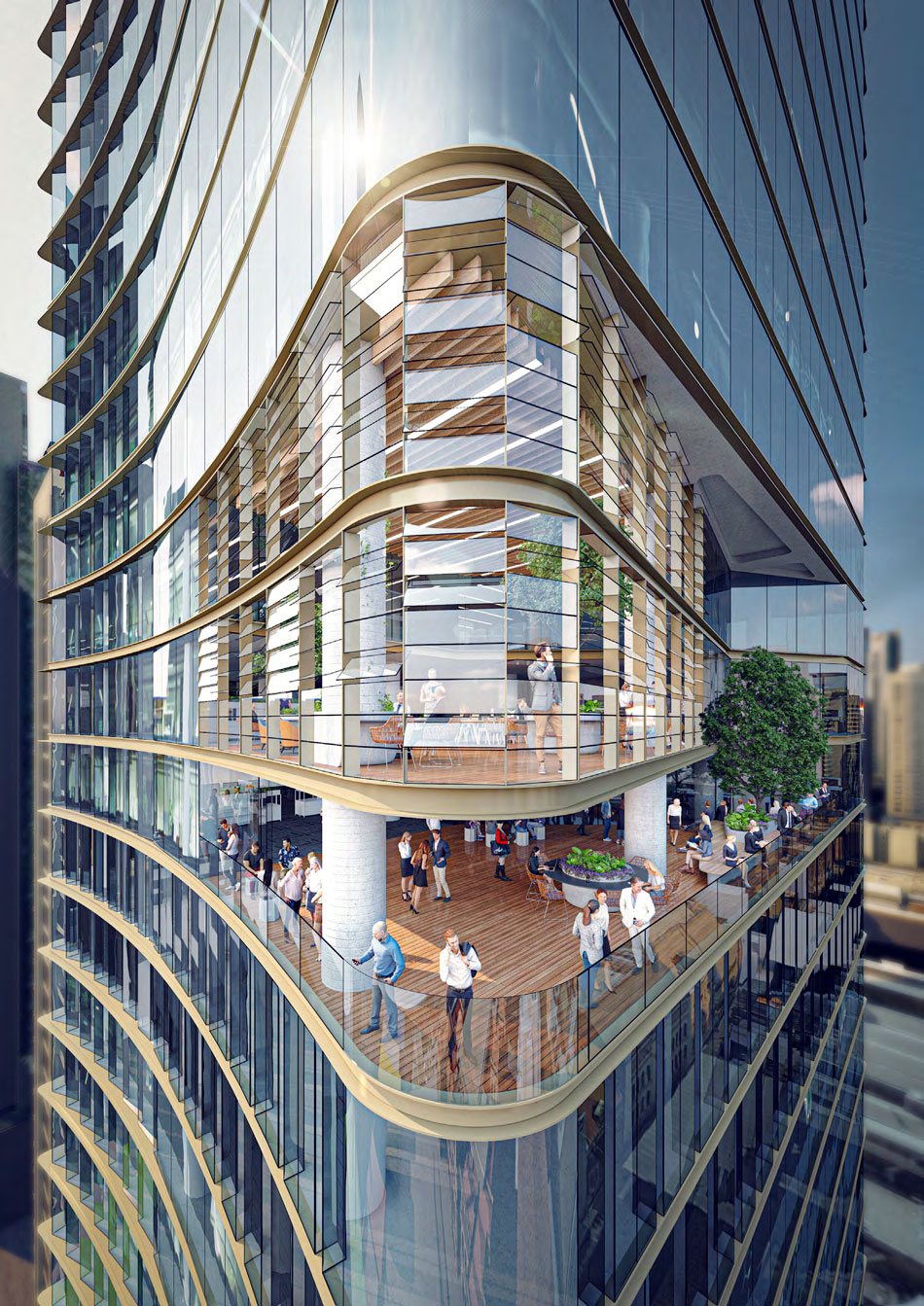
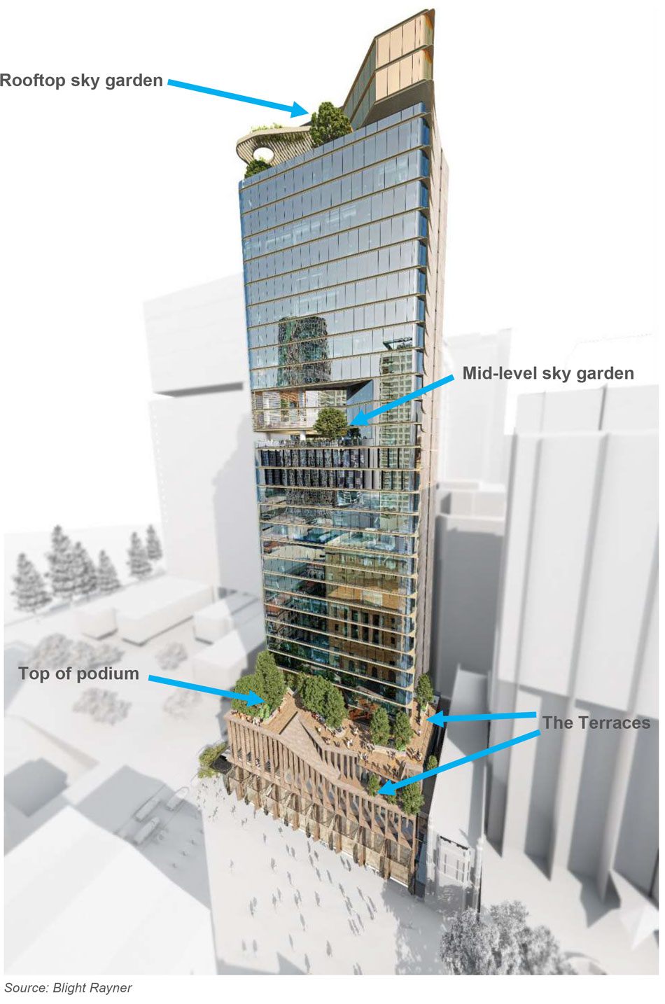
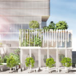
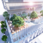
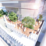
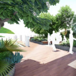
The 6-star green star proposed building also features a rooftop sky garden, mid-level garden and large landscaped terrace on top of the building’s podium.
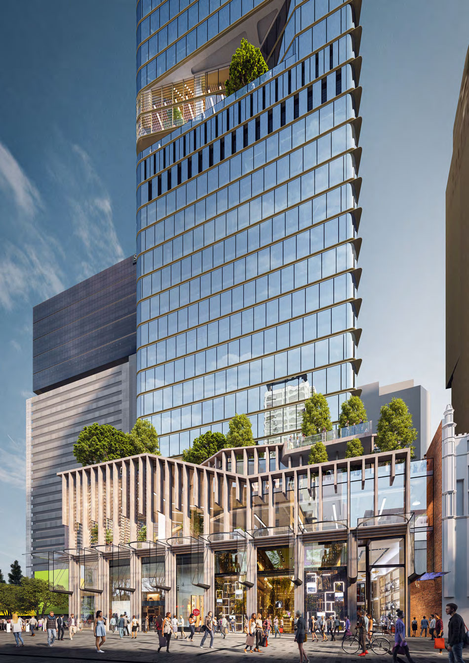
According to the application, a total of 1,300m of outdoor open space will be provided.
“Such high-quality architecture is consistent with Brisbane’s continued development as a new world city. It also positively contributes to Brisbane’s reputation as a world leader in promoting sub-tropical architecture.” – Blight Rayner, Development Application.

“60 Queen Streets‘ vision and ambition is to capture the essence of Brisbane.
“A place that marks Brisbane’s two most important streets as the gateway to the retail heart of Brisbane as well as becoming a counterpoint to the neighbouring developments, 300 George and Queens Wharf.
“The proposal outlines its organic approach both in planning, spatial relationship, landscape composition and environmental performance resulting in a well-proportioned tower allowing views into and out of the city. Our proposal embraces the subtropics and exemplifies Brisbane,” – Blight Rayner, Development Application.

A basement tenancy below ground is proposed which has a total gross floor area of 636m2. The space has been designed to be suitable for use as supermarket.
A mix of retail tenancy spaces have been provided at ground level within the development. An elevated mezzanine level is also proposed on podium level 1 for additional retail activities. These spaces have a total gross floor area of 1,889m2.
Project rundown
- Building height: 34 storeys commercial / RL 158.41m
- Primary usage: The primary use of the new building will be for office activities. Office activities are proposed at ground level and on all levels from podium level 2 to level 34 within the new tower. A total of 26,592m2 of commercial office space is proposed.
- Secondary usage: Basement supermarket tenancy 636m2
- Ground usage: Mix of retail shops and retail tenancies at ground level fronting Queen Street, George Street and Burnett Lane, 1,889m2
- The proposed development will have a tower site cover of 54.96% (1,019m2).
- Car parking: 97 car parking spaces
- Bike spaces: 210 bicycle spaces
New Laneway Arcade
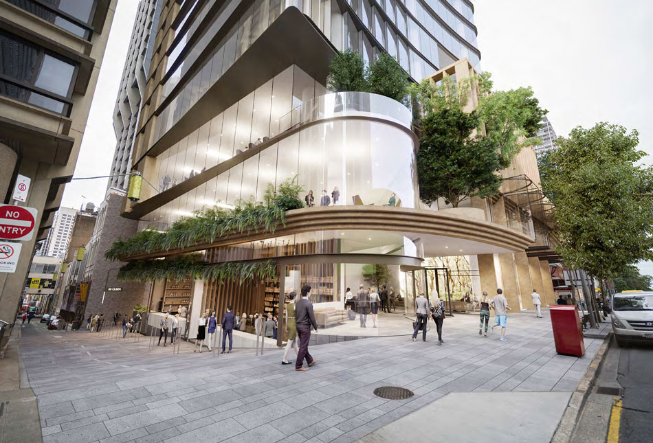
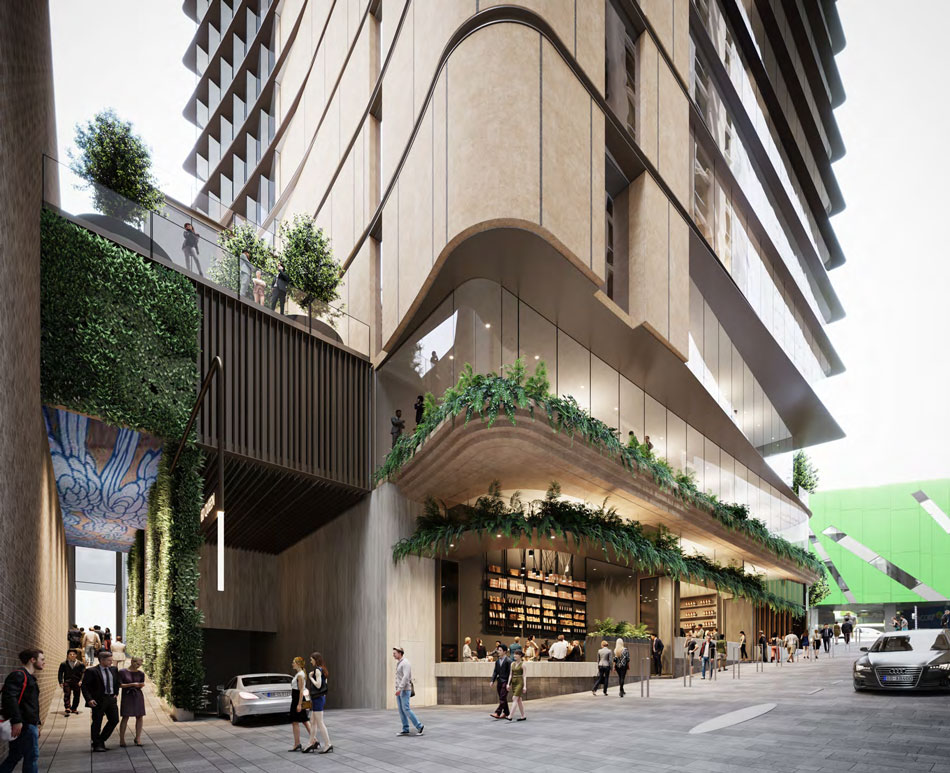
The development will also provide for the provision of a new laneway arcade connecting Queen Street Mall to Burnett Lane. The laneway would include the following:
- Artwork throughout the laneway including an installation on the laneway roof and the potential to project lighting artwork onto the wall of the neighbouring building
- A significant green wall
- Creative lighting throughout.
In 2018 Charter Hall bought 60 Queen Street for $94 million.
Plans
Architectual Plans
Tell us what you think about this development below in the comment box. The development application for this project, available to view on Brisbane City Council’s Planning & Development Online is A005520726.




Loving the previous plan more than this ????????????
Convex glass buildings are not a good idea. The convex glass walkie ‘torchie’ talkie building in the UK was melting cars parked below it in 2013.
I thought the No 1 Brisbane development was so much more exciting, sad it’s not going ahead. However This is better than the building it replaces
I like the building, but weren’t we supposed to be keep the Queen Street Mall free from buildings like this that create so much shade?
I like how there aren’t many car parks, though I still think that’s too many in a location like this.
Nice design, the facade is interesting. I agree car parks can be reduced
The design of this tower, although not bad, is quite bland and very typical of a glass sky box that requires insane amounts of energy to air condition all year. This isn’t a “building that breathes” no matter what they say. It’s also way too short for this prime real estate. But it’s better than the buildings that are there now, and more shops at the street side, as well as a new supermarket would be great. I’ve always thought there was a lack of easy to access grocery stores in the centre of Brisbane.
The soft form of the tower broken into segments is appealing, but not sure how glass louvres will cope with wind. Aurora Place Sydney has used glass louvres. Rubber stamped trees on the images are unconvincing. Look at 433 Queen street to see how its done properly. The nested laneway is great.
Another bland waste of space. Should have stuck with plan A that was more iconic and a better design.
What the hell is this. It like half the size of the prev design and looks sooo boring. First design was waaay better.
Lower left corner, Render 5 – I see a message for China’s Communist Party. Interesting…
This building will be a great edition to the CBD and will revitalise the South end of the Mall. I really like the Terraces and the historical pillars that blend in with the opposing building at 29 Queen Street, as well as the Treasury building. An anchor tenant in form of a supermarket will enhance retail activation within building and surrounding precinct. The proposed new laneway that leads onto Burnett Lane from the Mall will ensure that activation for Burnett lane remains the focus inline with Council’s objective of laneway revitalization.