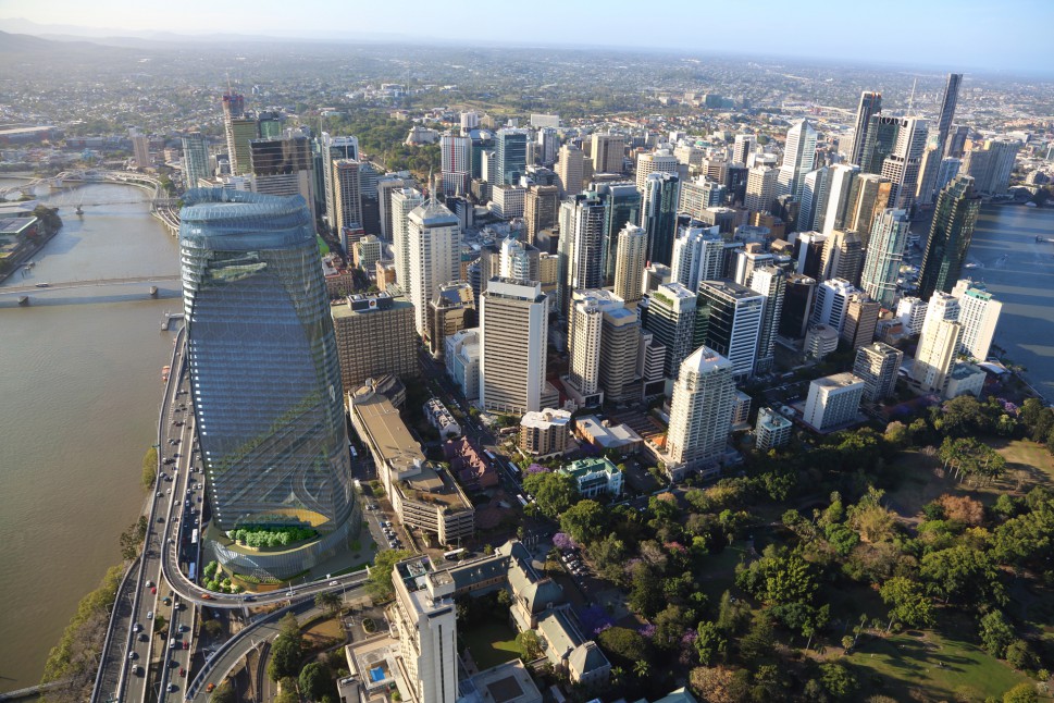
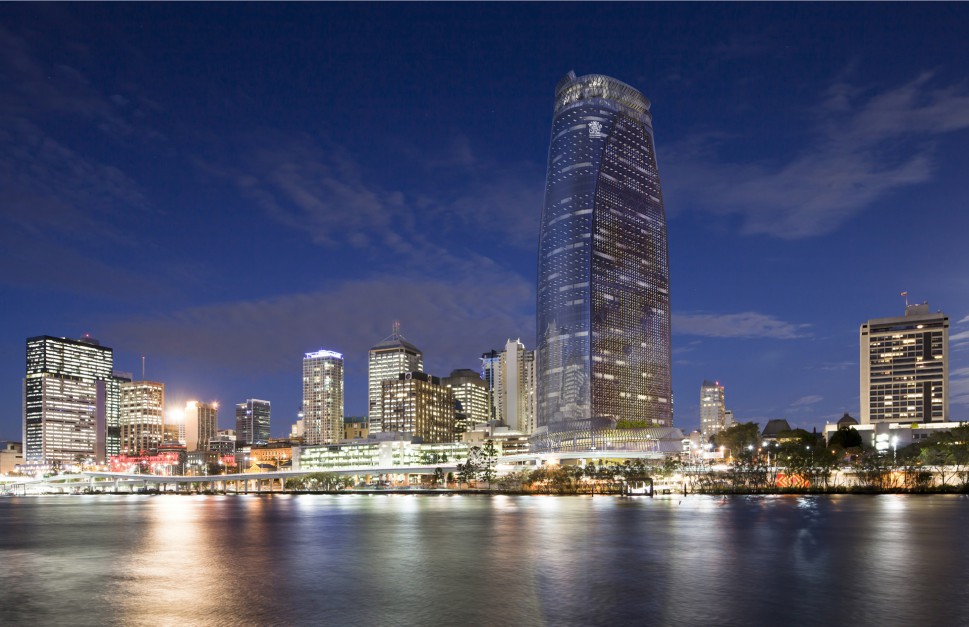
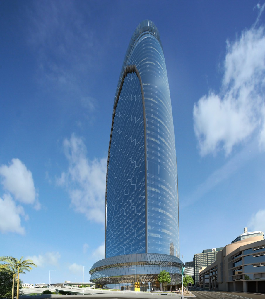
Plans have been revealed of the alternative design the Queensland Government was considering as part of the national tender for 1 William Street.
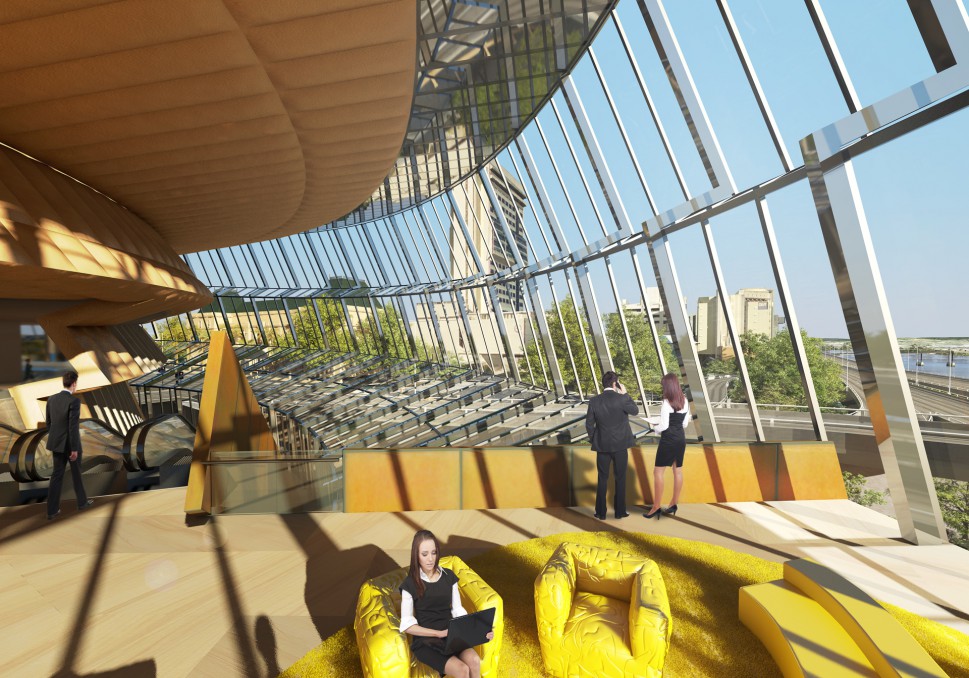
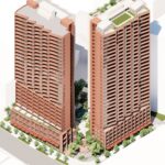
The runner up design by Grocon (seen above on the right) included a massive futuristic glass facade featuring LED screen lighting on the sides of the tower which could display the Queensland Government logo, images or any event related artwork such as a Riverfire theme.
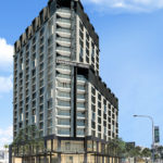
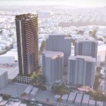
However on the 21st of December 2012, the Queensland Government announced that superannuation giant Cbus, was the winning tenderer for the massive 60,000 sqm government lease (shown above on the left).
Meanwhile, its not all doom and gloom for Grocon, in early December last year Grocon announced it had secured mining giant BHP Billiton as the anchor tenant for a $650m development at 480 Queen Street, Brisbane, work on that project is predicted to commence soon.
So now the question arises, which design do the people of Brisbane prefer?
Cast your vote at the end of the post or voice your opinion in the comments section below.
Grocon’s ‘One William Street’
Renders and video by our vision.
Cbus’ ‘1 William Street’ (Winning tender)
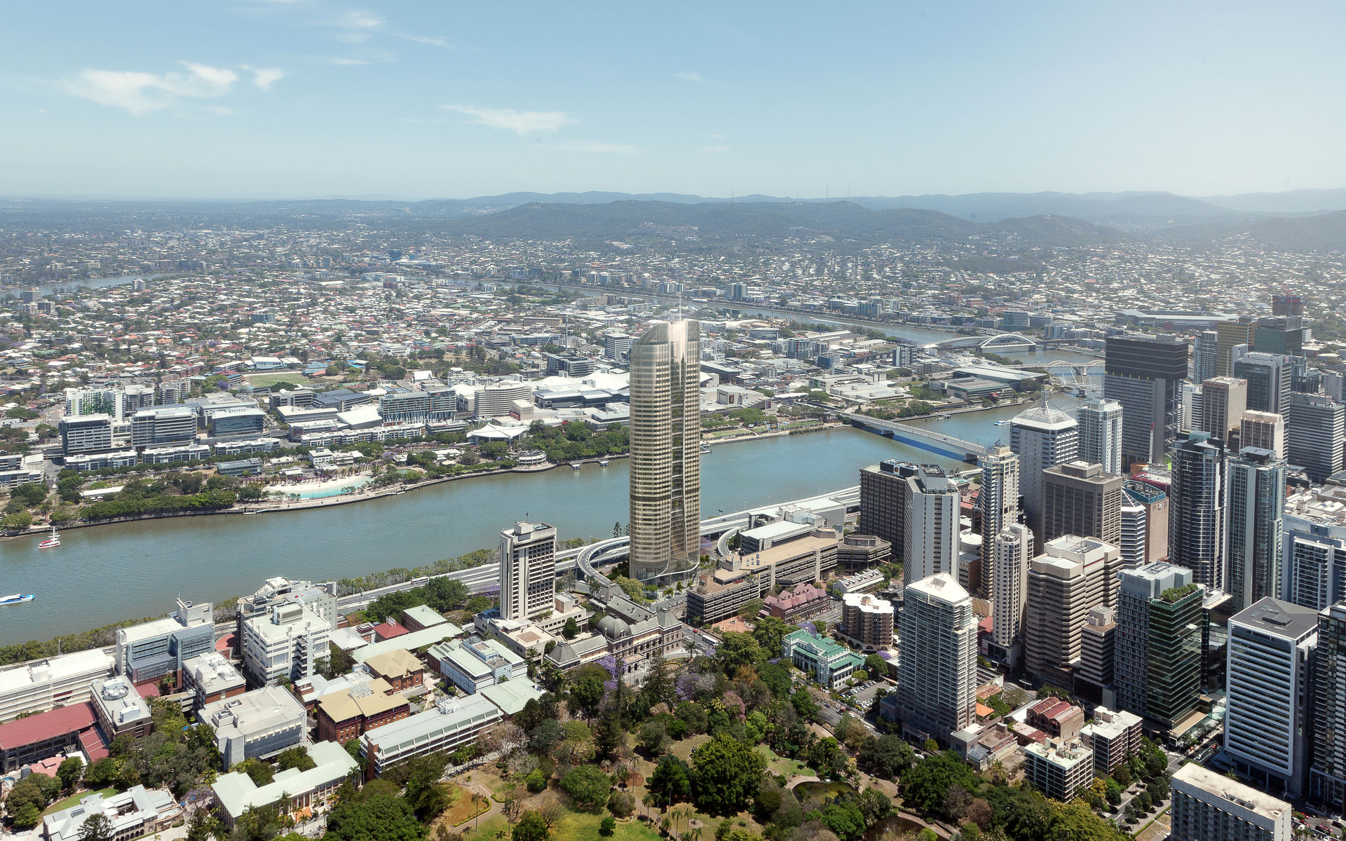
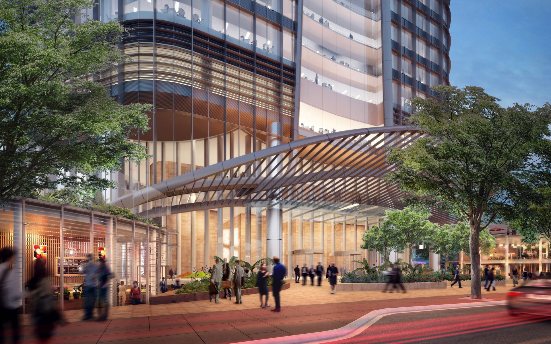
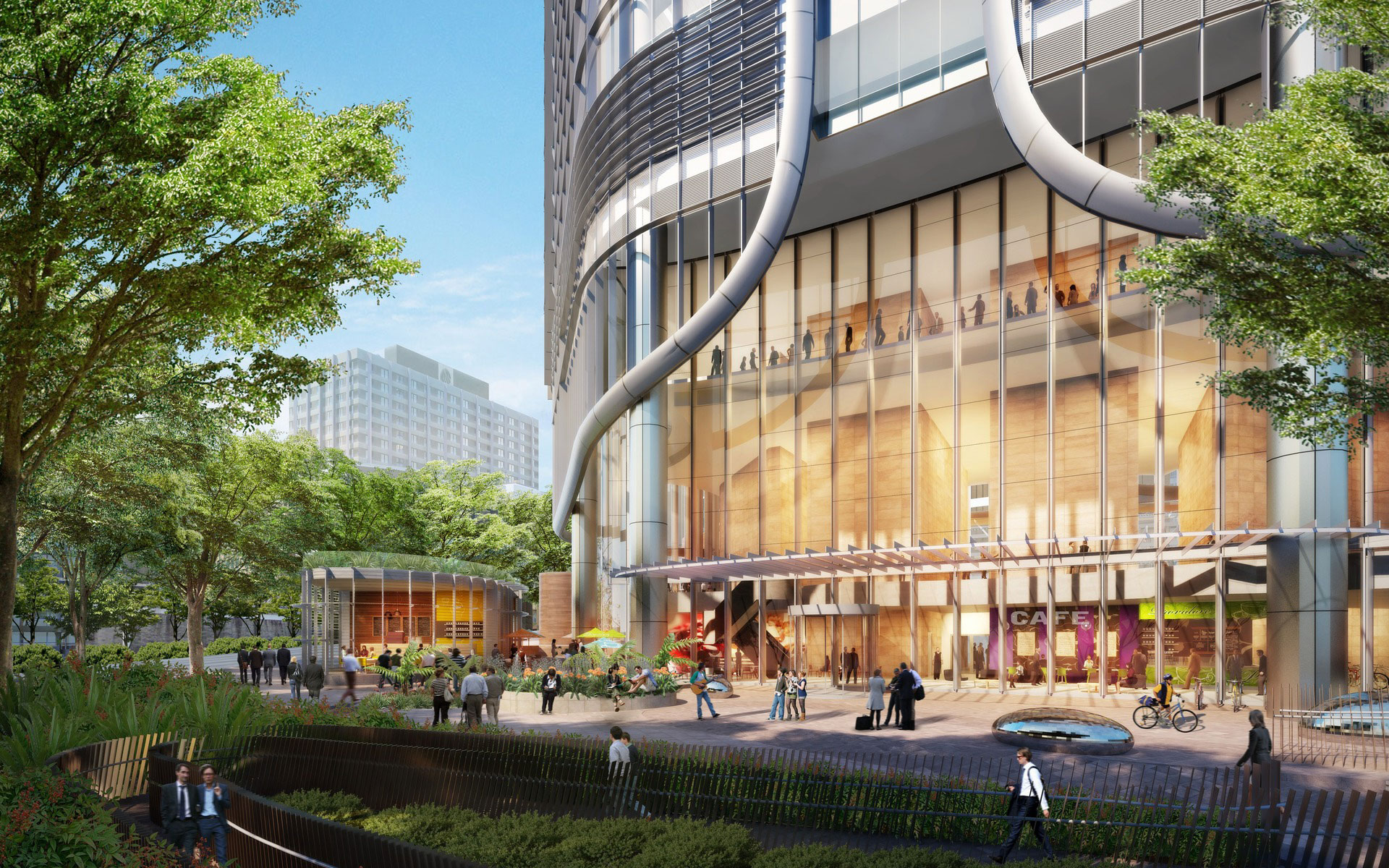
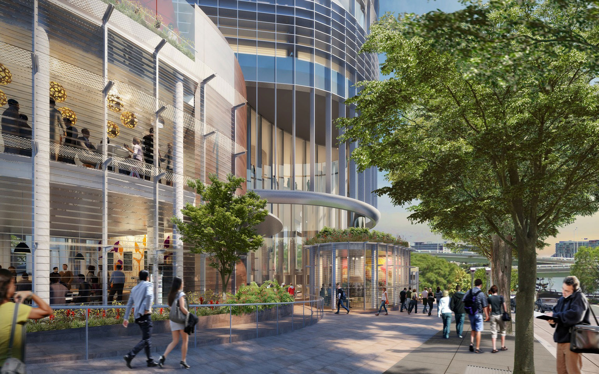



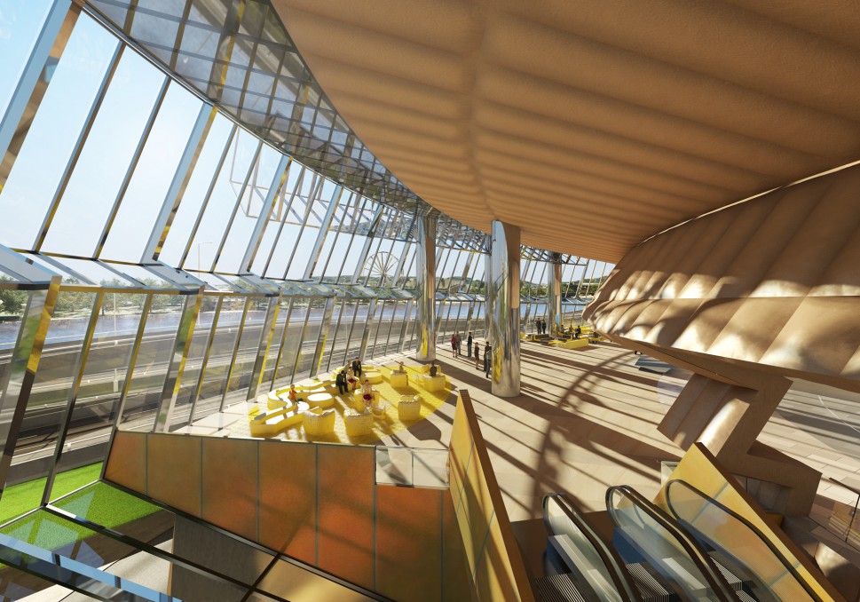

The Grocon building looks very cool but from my perspective was a little too overstated for Brisbane.
The CBus building doesnt really set any new benchmarks but it looks appealing jsut the same.
Honestly… BOTH of these building seem too fat for Brisbane. I mean, look at these buildings around 1 William Street, they all are so tiny so it would look rather stupid to have a massive bug sticking out into the sky…. unless if the architects design something architecturally radical for the city that would brand the tower as a landmark tower for Brisbane, think of the Chinese Television Tower in Beijing.
If I had to choose one of them, I’d choose Grocon Tower because it actually does look amazing and architecturally radical despite of its fatness.
At first I thought Grocon’s was over the top.
Then I thought about architecture of leading buildings such as this in Australia. Compare our sky scraper architecture to other countries’ – quite frankly, we have nothing which could be called “leading edge” in any way. We are boring and conservative. That’s part of what I love about traveling to major cities in other countries.
Shame.
Grocon, what a chode!
I agree with Wheelbarrow. Why do you need a fat erection, its makes the tiny ones envious.
I love the impressive perspective moving down the Riverside Expressway. Both designs, Grocon’s especially, are almost ‘Nineteen Eighty-Four’ ish, in the sense that the Government will be monitoring, given the prominent position. They convey a great sense of power, which is quite suitable, given that whichever design is approved, will be built as a Government building.
The size of the buildings, as I mentioned before, is impressive, but doesn’t work for me in the approved position. Brisbane’s towers are slender and this will detract from the wall of towers along both sides of the river. Grocon’s design will, however, compliment the new QUT Gardens Point development with its glass facade and advanced appearance. In my opinion, a building of this mass should be built further towards the CBD, which appears to be a valley filled with mediocre or older, smaller towers.
Brisbane wants to be Australia’s new ‘world city’. The CBUS design is quite standard and fits in well with the current skyline in comparison to Grocon’s proposal. In that sense, I like it, because it doesn’t stick out as much. However, I like Grocon’s proposal, because it supports Brisbane’s ‘world city’ motif. It’s a step forward in terms of architectural diversity and will, hopefully, encourage architects to continually strive for leading designs.
Overall, I have to say, I prefer Grocon’s proposal.
Cbus for the government, a nice simple fixture, safe you might say.
The other new tall is looking fantastic.
Grocon’s design is better, in that such a large mass should be artistic, both are too big though
What a shame… would have been nice to have some visionary architecture (Grocon) instead of staid conservatism (Cbus).
I agree with other commentators that the size of the thing (regardless of design) is perhaps not appropriate for it’s location: context within the local environment and so on.
I was impressed with the Grocon feature of changeable exterior to complement cultural festivals, communicate and exhibit enhanced (& hopefully pleasantly artistic) displays. Cbus is just bland.
Finally, why can’t we have the things covered with non-reflective Photo Voltaic s or cutting edge energy generating coatings?? Sigh
I am at odds with both of them. Wish we could of had the ‘never to be built there, so why can’t we have it here’ Chicago Spire instead (obvious arguments aside).
The Cbus reminds me too much of a lipstick, very simple design. A competition was held to see how quickly someone could recreate it (plus putting it on a map) in Sketch-Up, winner took 4 minutes from starting the program… yeah.
The Grocon building reminds me too much of the evil boxy robot from futurama… http://theinfosphere.org/Boxy_Robot
Chicago Spire: http://en.wikipedia.org/wiki/Chicago_Spire
as the world’s leading cranespotter, i’ll be watching this development with a keen eye. the CBus building would be cheaper to build & thats why Govt would have picked that. All Govt tenders go to cheapest price #Fact (rather than best value for Money). I prefer to see the Grocons building in the Skyline over “the Exhaust” thats garn ahead.
Walking to work every day past the Shard and having worked in the Gherkin its a real disappointment that back home this of cheap looking rubbish is proposed. Accepted its a Government building and expectations should be low… but please!
Something slanting back from the river / goodwill bridge with more character thanks.
Both proposlas totally ignore the beautiful low rise heritage buildings around them and the beautiful and sympathetic Neville Bonner building – how you can stick a huge monstrosity next to the neo-clssical architecture of Parliament and George Street government precinct I cannot fathom.
I thought we learnt the lesson with the Parliamentary Annexe the ugliness of which we have to live with every day. Typical Brisbane – never learns.
Go back to the drawing Board and get some heritage architect’s advice.
so who is paying for this giant over appointed lipstick?
Yes true that both buildings are way too big for Brissie. But it also means that the state government might carry out demolition of several low levelled government buildings and be planning for the new skylines for Brisbane looking from South Brisbane, along with recent forward upon consent of high rise buildings on South Brisbane-West End area.
Who is “designing” this rubbish? That looks like a giant pill bottle – the problem is still that they are both too big fat & ugly for the site & its surroundings. Both buildings would fit perfectly in the architectural hotch potch in places like Dubai and Shanghai, but not here.
We have a rare opportunity to create something truly great here – these proposals don’t come anywhere close to fitting that criteria.
grocon versus CBUS….. which dysfunctional attention seeking developer sotle the most limelight for the work of the architects/design team?
this building will serve as a beacon for fascist,authoritarian style decision making. at a guess, grocon will line up as the builder for CBUS now that they lost the bid….. why is the LNP government& Kev07 throwing so much weight behind grocon? which politicians are invested in grocon and who would benefit from grocon’s imminient public listing?
Would be good to see the actual architects who designed these buildings credited for their work in conjunction with the developers.
As somebody else mentioned they do both look too ‘fat’ and really stick out from their context. I think either way the building will have a pretty negative impact on that part of the city skyline. I think I would pick the giant lipstick as the least offensive!