


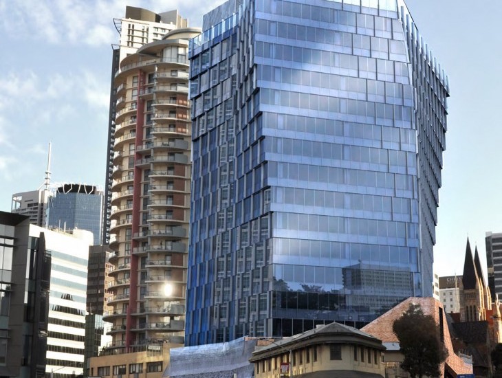
Consolidated Properties has proposed a 17 level office building situated on the site of the former Emerald Tower development.
Designed by John Wardle Architects, the proposal includes a ground level restaurant/café fronting Ann Street and Clark Lane.
A Sky Garden is proposed on the roof top with extensive views of the city which will provide a flexible space for catering small gatherings to large corporate functions.
Components of the Sky Garden are covered by a weatherproof shade structure and glass screens around the edge as part of the building façade to reduce wind impacts.
Development in this precinct is intended to provide an introduction to the Brisbane CBD and make a strong statement as part of the ‘northern gateway’ to the CBD, whilst respecting the existing heritage values of the area in any design considerations.
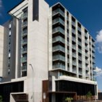
Consolidated Properties is known for developing AM-60, situated on the corner of Margaret and Albert Streets.
According to the DA,
The proposed building seeks to re-establish the Queen Street and Ann Street alignments, and activate Clark Lane, Ann Street and Queen Street.
The brick podium, housing the café to Ann Street, returns to Clark Lane, and addresses Webber House and its courtyard and entry.
Placing the entry to the café in Clark Lane, and with a window providing a further visual connection, activity to the laneway will be significantly increased.
Café seating is proposed to Ann Street, adjacent to the Ann Street entry and sheltered in an undercroft area. The café seating, people entering and leaving the building will combine with activity in the meeting spaces immediately inside.
The generous heights of the Ann Street and Queen Street lobbies provide a gentle transition from the public realm. The public realm is extended into the Ann Street undercroft area, and a visual and physical connection is created between Queen and Ann Streets via the linked lobbies.
The Queen Street lobby is presented as a grand space, rich in materials and detail, visually connected to the public realm with a fully glazed façade, and protecting canopies.
Fast Stats:
- Total GFA 18,529m2,
- Parking for 72 cars, over 2 basement levels
- End of Trip Facility for cyclists


I like the colours! But it looks too stumpy. They should building a tall skyscraper here! Lots of potential in that area with near SkyScrapers!
A little bit disappointing to see that it will be only 17 floors high, especially with its amazing subtle “twist” design! It should go up to at least 40 to 50 floors high to make an impact on the city skyline, maybe higher to compete with neighbouring Soleil.
At last! Brisbane developers are planning a highly sculptural highrise. This is close enough to perfect, Brisbane needs some prestige at “the gateway” to the city. All the best!
Looks awesome. I agree should be taller
Its all well and good to say it should be higher, but the Brisbane market can’t handle huge buildings which is shown by how hard the current proposed developments are finding it to move ahead. This smaller size can be quick and handled by the market.. a good size considering the location
Oh god, it’s an icon! Just when you thought it was safe to reenter architecture on the grounds that no one can afford iconic office buildings any more, this arrives.
I sometimes think that on projects like this, the architects don’t really draw elevations or consider context, which is why they turn out so awful. In this case, they drew the plan, had a meeting about it, thought “that looks great!”, buffed it up in photoshop and sent it out.
Stop ! Listen to that voice inside that you’ve been trying to kill for decades. You’re designing shite, and all the ethical company statements in the world won’t save you from the devil at the final architectural reckoning.
I hate it when Brisbane gets shat on by a terrible commercial architect from Melbourne selling some inane, poncey form and calling it design. This is not architecture, it’s bad branding crossed with floorplate
No way, Moon Doggy, this looks sexy and is just right for this end of the city. Anything higher, awful, anything lower, yuk,
Like Special K, just right.
The old against the new is a beautiful look, love the old pub in front of this building.
Love the design but agree with others should be ALOT taller
A lot of comments about the lack of height on here. Unfortunately there is always the element of feasibility that most people miss. No doubt ConsProp stitched up a good deal where they did have to build a 20 storey tower to make it stack up. Thus less risk!
Lets see if it gets out of the ground.
Hate it. That corner needs a special, possibly something that is leaning back into the city with a little bit of height. This design looks like something a grade 8 graphics student would do!!
Out of proportion! Stop demolishing old buildings with actual heritage and style to be replaced by tacky looking skyscrapers that no one will notice as soon as it’s finished.